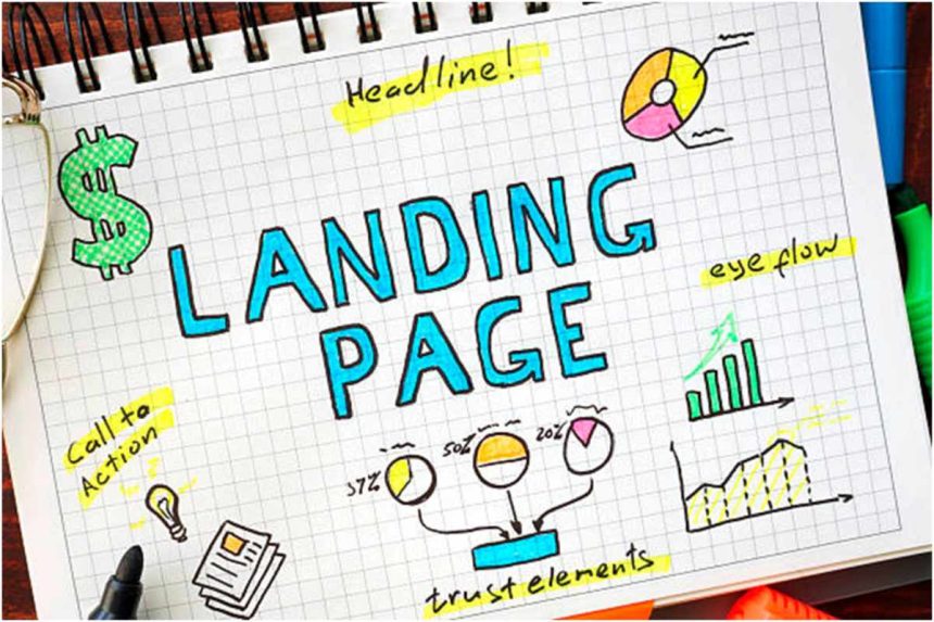
You could do everything right and still have lower-than-expected website conversions because your landing page isn’t designed to convert. Many businesses have failed to increase conversions because they optimized everything but forgot to pay attention to a landing page design that converts.
How important could a landing page be when you have your paid search ads and SEO marketing strategies running at a hundred percent?
Two words – Very important.
The landing page of any website is the first contact point visitors have with any business, and you know that first impressions matter. Your ranking on SERP, and social media ads can bring traffic to your website, but what would keep that traffic and convert it is a creative landing page design that converts.
Building one isn’t difficult. It’s all in the elements. What should you include in your landing page design? What should be left out? How do you make them compelling enough to convert traffic?
Also Read:– Bloomergblog
You can find out with these five ways.
1. Keep Your Headline Catchy
A headline is ideally the first thing any visitor to your landing page sees, so that’s where conversion starts. But this will only happen if you have a headline compelling enough to arrest your visitor’s attention.
But how do you write a headline that converts?
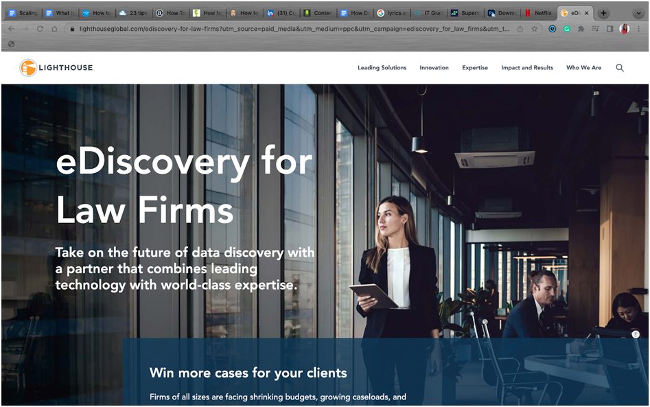
First, your headline needs to be attention-grabbing to give your website a chance to convert. But it doesn’t just have to be a couple of words strung together to sound witty. It should convey what your services are about in the simplest way possible and lastly, it should stay under ten words.
Marrying these conditions may be difficult, but that’s because most designers spend a long time complicating things and looking for sophisticated words.
A tip? Keep it simple and clear.
If you have anything extra to add make it part of the supporting sub-heading attached to your headline.
Here’s an example of a company that got it right.
2. Optimise Contact
You have a higher chance of converting visitors to your website when you have an open means of contact. With a live chatbot, people can get quick responses to their questions and help to find what they are looking for if they need it.
It doesn’t only have to be a live chatbot. You can highlight other ways of contact, such as email or phone calls. Some websites include a phone number and email. People want to be able to reach you when they need you.
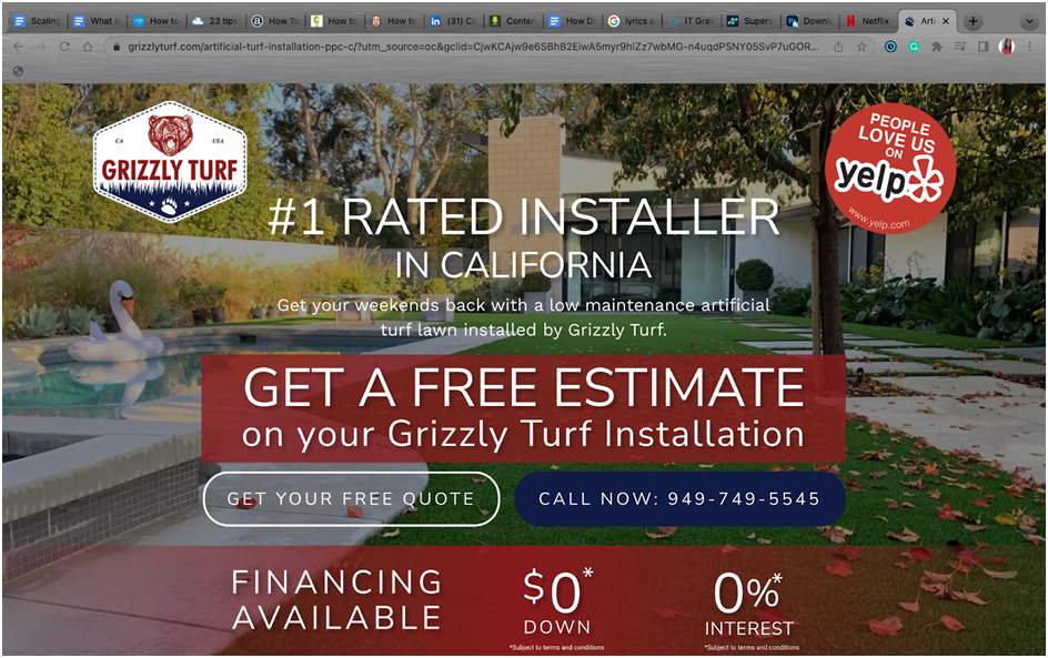
You can merge your landing page offer and CTA with your contact information just like this landscaping website did.
3. Go for a Clean Landing Page Design
If your landing page is your first impression moment, isn’t it good to let visitors know everything you’re offering? Kill ten birds with one stone?
No.
No one feels comfortable listening to the life story of someone they just met, and if your website landing page design is cluttered, that’s what visitors to your page would feel. But beyond how uncomfortable the aesthetic of the design layout on your landing page is, the bigger problem is that a cluttered design diverts visitors’ attention to many other things on your website. By the time they’ve gone down two or three pages, they might not have signed up for a service and converted. In the worst-case scenario, they get overwhelmed and leave without clicking on anything because your website design is cluttered.
Aesthetics is also essential, but not just good colors. You need a design that highlights the action you want visitors to take. There are a few ways to get this done.
- Videos
- Bold Fonts
- Whitespace
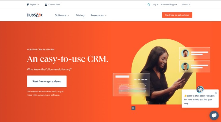
Use whitespace and bold fonts to center your offer and make it the most obvious thing to visitors.
Hubspot’s home page is an example of a clean landing page design.
4. Include Social Proof
Most visitors to your website would read your copy, watch the videos you’ve put up, and believe in your ability to offer them a service or product. Some visitors won’t until they see proof.
That’s what social proof is about – letting potential customers see that you can and have backed your copy with actions.
Besides helping you sway customers on the fence about getting your service, testimonials also build trust between you and the visitors to your page. It is that trust that would make them convert to paying customers.
But you can’t just throw social proof at your landing page. Where and how you place them is crucial. Here are a few tips to help you maximize the social proof element on your landing page.
- Put your best testimonials up top and above the fold
- Include and highlight direct quotes from past clients that endorse your service
- Keep the design templates for the social proof simple and focused so the attention would be on the testimonials themselves.
- If you can, use company logos to show current and past clients.
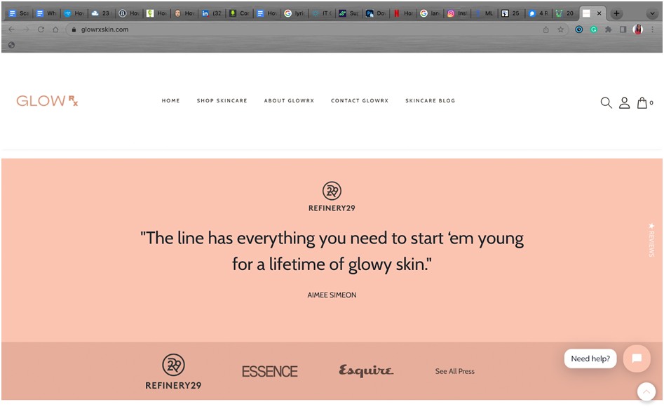
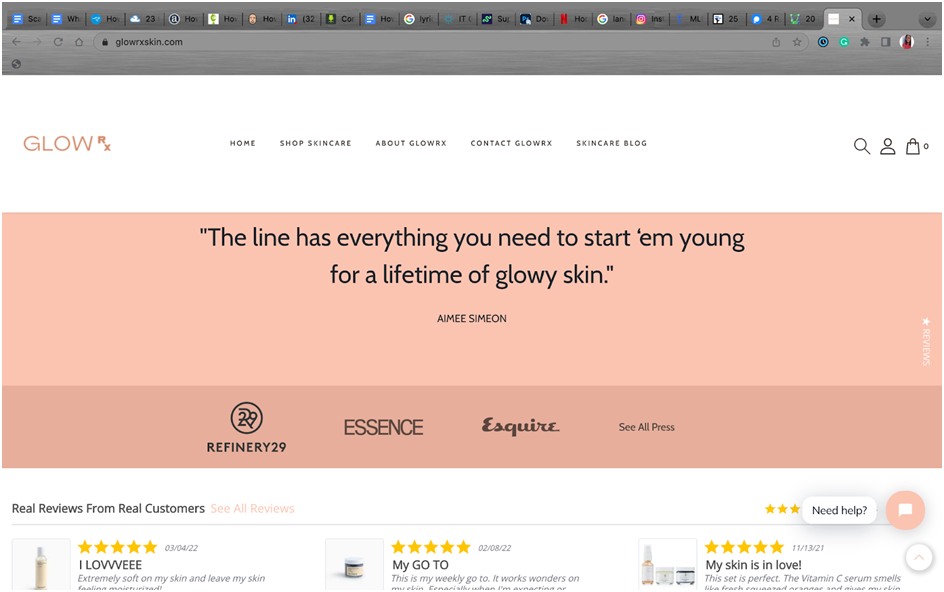
Take a look at how GlowRx addresses social proof on their landing page. First, they highlight one quoted review from Refinery99, and directly under this, they add the logos of important brands. The truly exceptional part is the carousel of reviews and testimonials about their product located under the logos.
5. A/B Test Landing Page Elements
Like your marketing strategies, the factors that affect conversion on a landing page change with swift regularity. The only way to stay on top of that is to switch things up every once in a while. This is why A/B testing landing page elements is one of the ways you can position your website landing page design to be converting.
There are so many helpful tools for this, and a few of them include:
- Google Analytics
- Optimizely
- VWO
- SiteSpect
Use data from these tests to figure out what’s wrong, what could be adjusted, and what has to go on your landing page. Test different variations of the position, wording, and template of the elements on your page.
Conclusion
Getting visitors to your website is one thing; getting them to convert is another, and the bridge lies in your landing page. What website graphics you use on your landing page, where you place these elements, and how you optimize those elements for maximum performance are essential. The best landing pages pay attention to what matters and build up on that.

